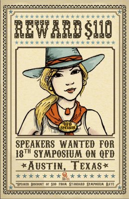
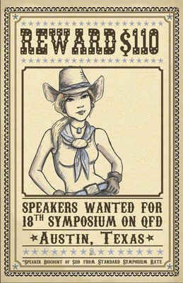
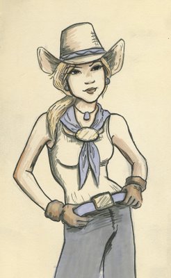
 My mom asked me to do a second version of the cowboy postcard for the QFD Institute, but this time with a girl. They're in order from top to bottom, the top was the final card.
My mom didn't like the original hat because she said it looked like Donkey Ears.
I happen to like the hat very much, but it's her card. So, using the convienient magic of photoshop, I have the hat a different brim.
It's just as well that her body gets cut off in the end, because it's a little wierd, and the arm on the right is just awful. I suck at foreshortening.


7 comments:
haha yeah the first hat looks like a burro.
i dont believe in evolution- i didn't come from no cowgirl.
anyway it looks cool. hey why were you commissioned to draw a cowboy andyou drew an old man, then you were asked to draw a cowgirl and you drew a young woman??
I drew a young woman because my mom mentioned the Animators Ink Poscard girl when she asked me to do a second card.
yeah she has A. ink pose too
I think her head is too big...and she seems slightly cockeyed. Oh well...i did it in a rush.
cowgirls are cool.
I really love the borders and design of the page, too~ nice work! =)
Hi,My little brother likes blogging, and we soon create our own blog
I wish and hope to start a similar blog like this one...
Keep it up! Fjord Westfalen
Post a Comment